USD
USD


Vogue Theme
Vogue BigCommerce Theme is a multi-purpose theme that can be used for any type of online store. We have created 3 different variants for different types of industries. Vogue theme is tested by bigcommerce and Built with Stencil framework, latest version, and update to date. Compatible with BigCommerce latest version.
Vogue theme also supported various features of bigcommerce like mobile friendly, Google AMP, Schema data, Various applications supported, Page builder, Theme editor, Sidebar, Mega menu, Carousels, Newsletters, banners etc. We have tried to help our client with the documentation with a detailed explanation.
Header & Footer
In your control panel, go to Storefront > My Themes, and click the blue "Customize" button to launch Theme Editor.
In the left hand column of the Theme Editor, click the panel labelled 'Header & Footer'.
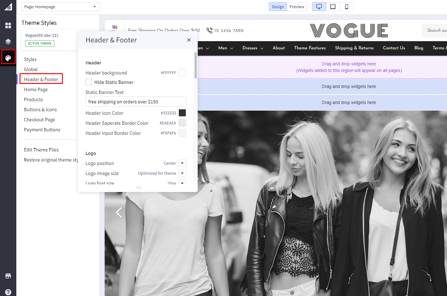
Header
Hide Static Banner: If checked, it will hide the top marketing banner, i,e.free shipping on orders over $150.
Static Banner Text: Top marketing banner text that will be visible in all pages. Here, free shipping on orders over $150.
Logo position: aligns the logo left, center or right. Applicable for both image and header content.
Logo Center View :
Logo Left View :
Logo Right View :
Home Page
In your control panel, go to Storefront > My Themes, and click the blue "Customize" button to launch Theme Editor.
In the left hand column of the Theme Editor, click the panel labelled 'Home Page'.
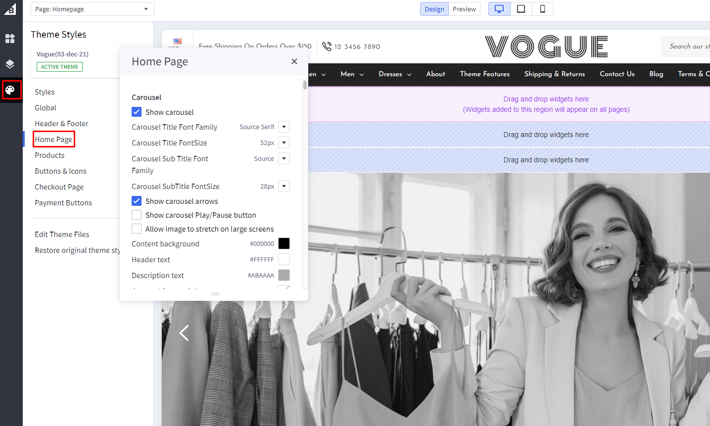
USP Section
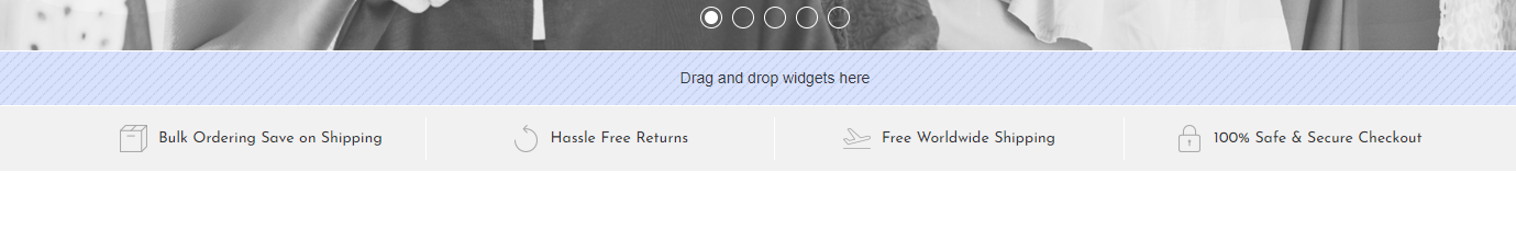
- Hide USP Section: Toggles the visibility of USP section.
- Number Of USP Sections: set how many USP blocks you want to shown.
- USP Background Color: Background color of USP Section.
- USP Text Color: Change color of USP text.
- USP Border Color: Change the color of the border between two USP texts.
- USP Images:
First, you need to head over to "Storefront > Image Manager" and then upload your images here.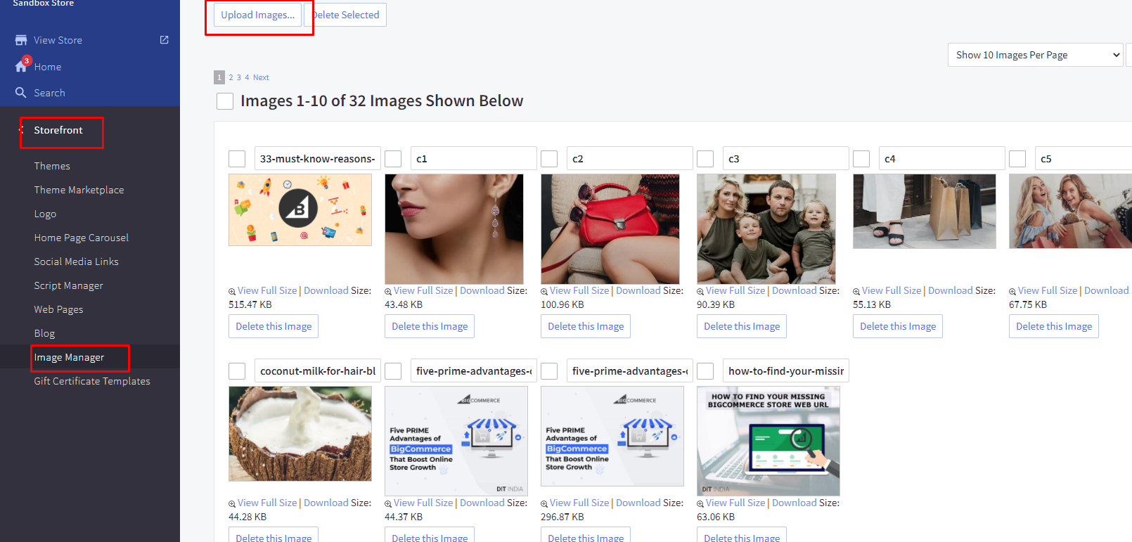 Then once uploaded, click "View Full Size" to open the image in a new tab and copy the path to that image url.
 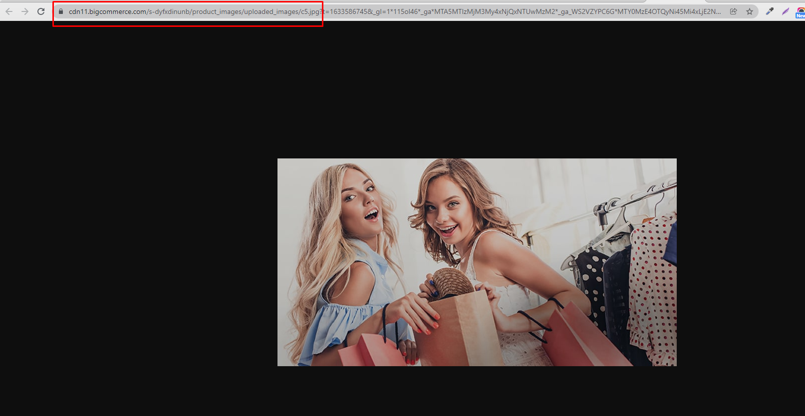 Then paste the image url into the category image input box:
 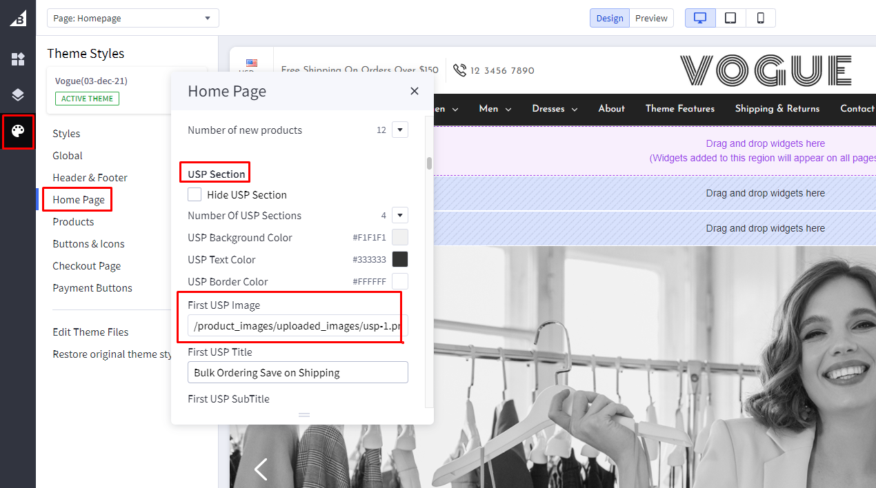 Repeat these steps for each category image. Don't forget to give each category a title and a link. Also you can add subtitles.
Category Section
Number of Shop By Category: You can change the number of category images to be shown to 3 or 5. Depending on this selection the categories will show in a square grid, or a masonry style layout.
Most Popular Products
Hide Most Popular Products: toggle the visibility of Most Popular products section.
Most Popular Display Mode: Select the Most Popular product display mode.
- Default Mode View:
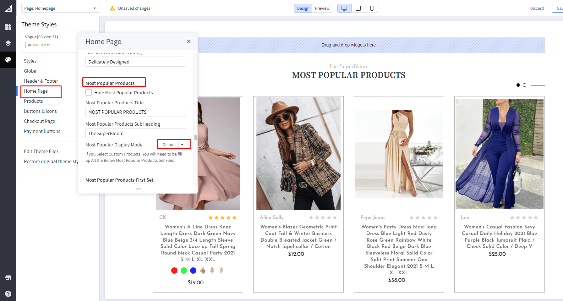
- Custom Mode View:
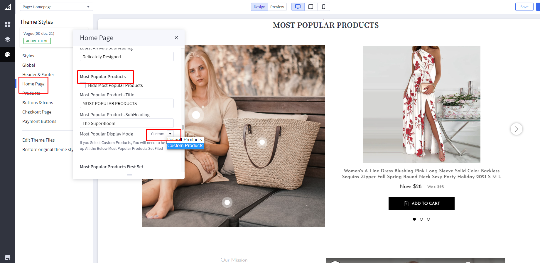
If you Select Custom Products, You have to fill in details of product set options.
Most Popular Products FirstSet:
- First Main Image: paste the image path of left section image.Steps are same as mentioned above.
- First ProductID: - Right click on the product image of a particular product you want to show in the right side section and open it in a new tab:
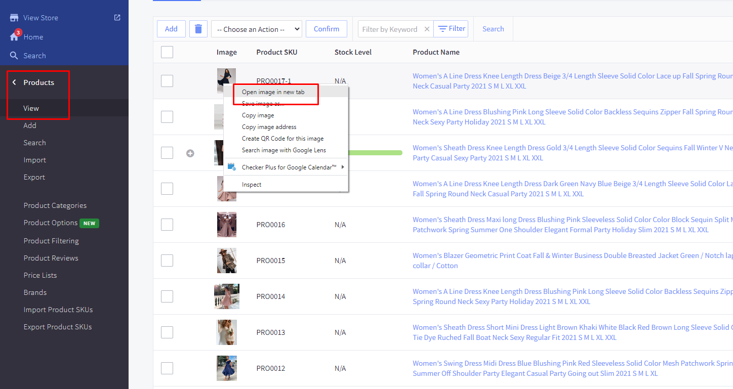
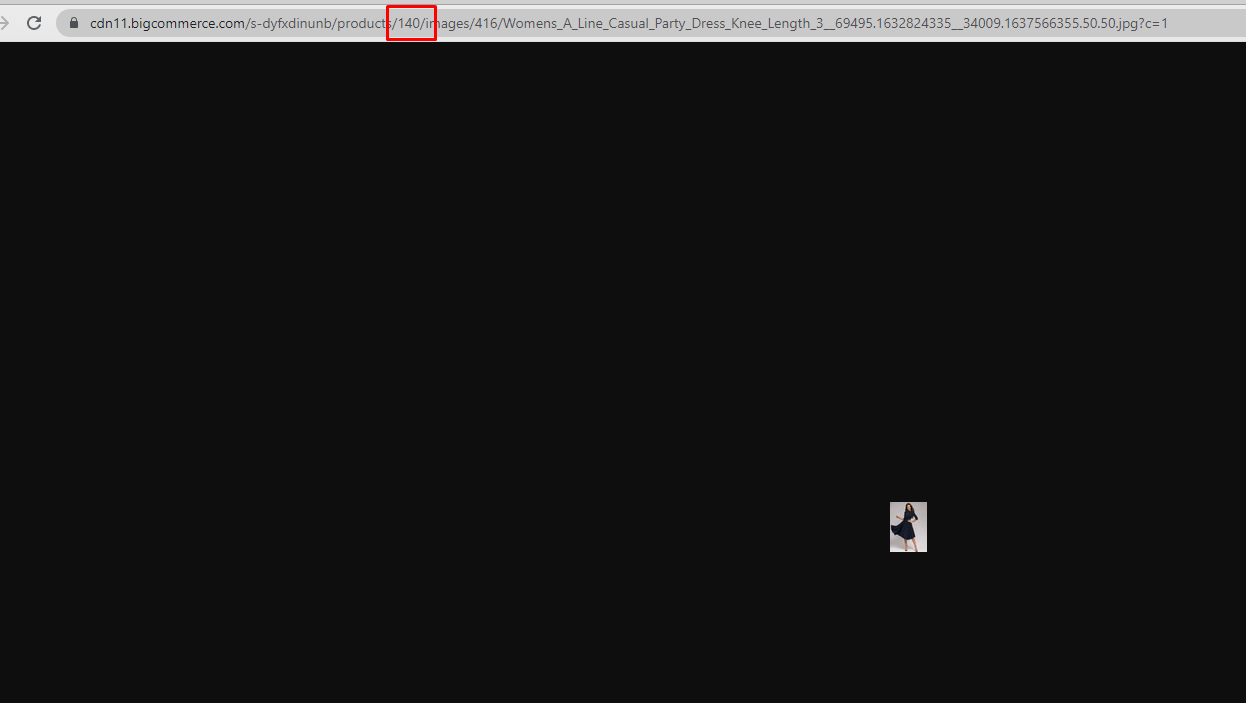
- - That image will open in a new tab. Find product ID right after "/products/" in the image URL.
- - Add that Product ID and dot positions in percentage(%) from top and left.
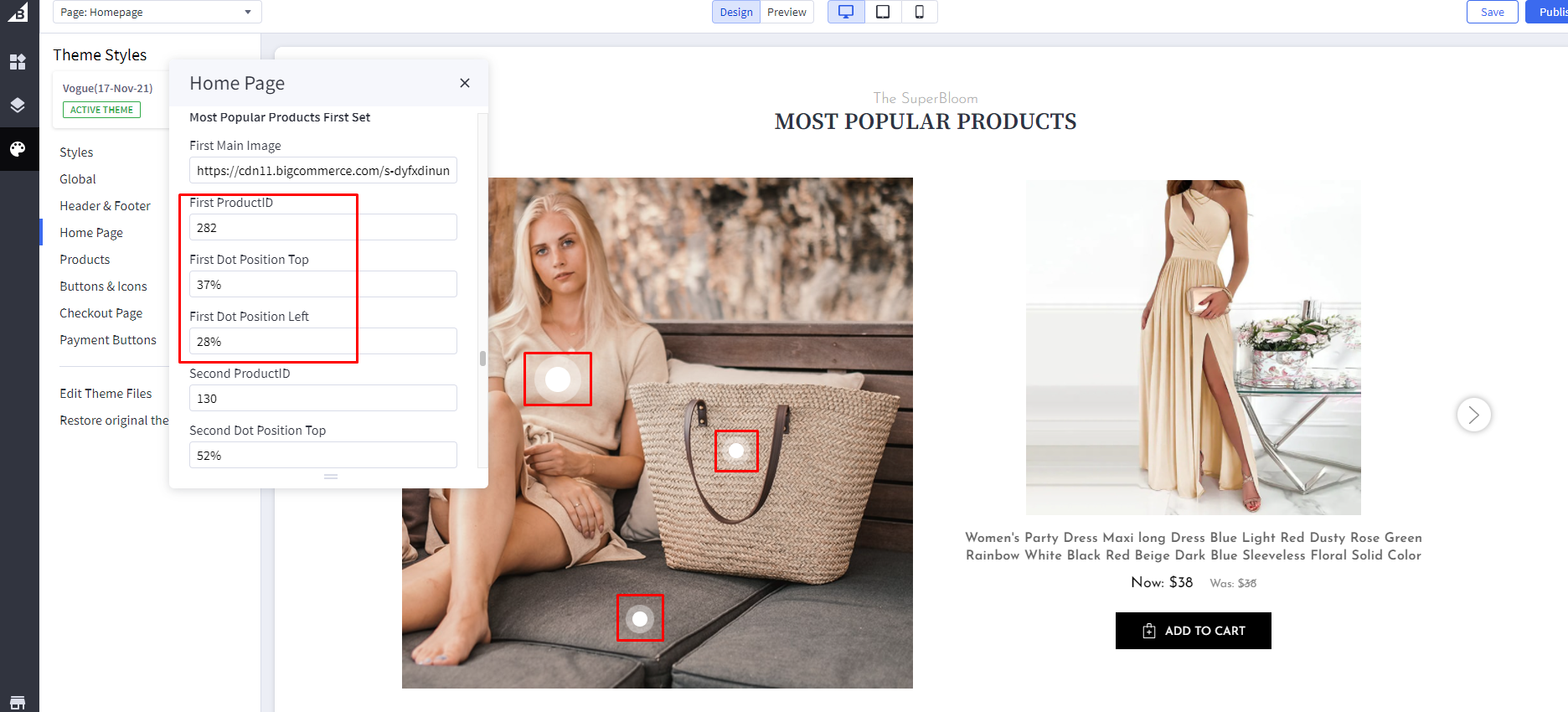
- Similarly, you can add two more products to show on right side that will appear as a slider .
You can add two more sets of images and products and that full section will appear as a slider.
About Our Story
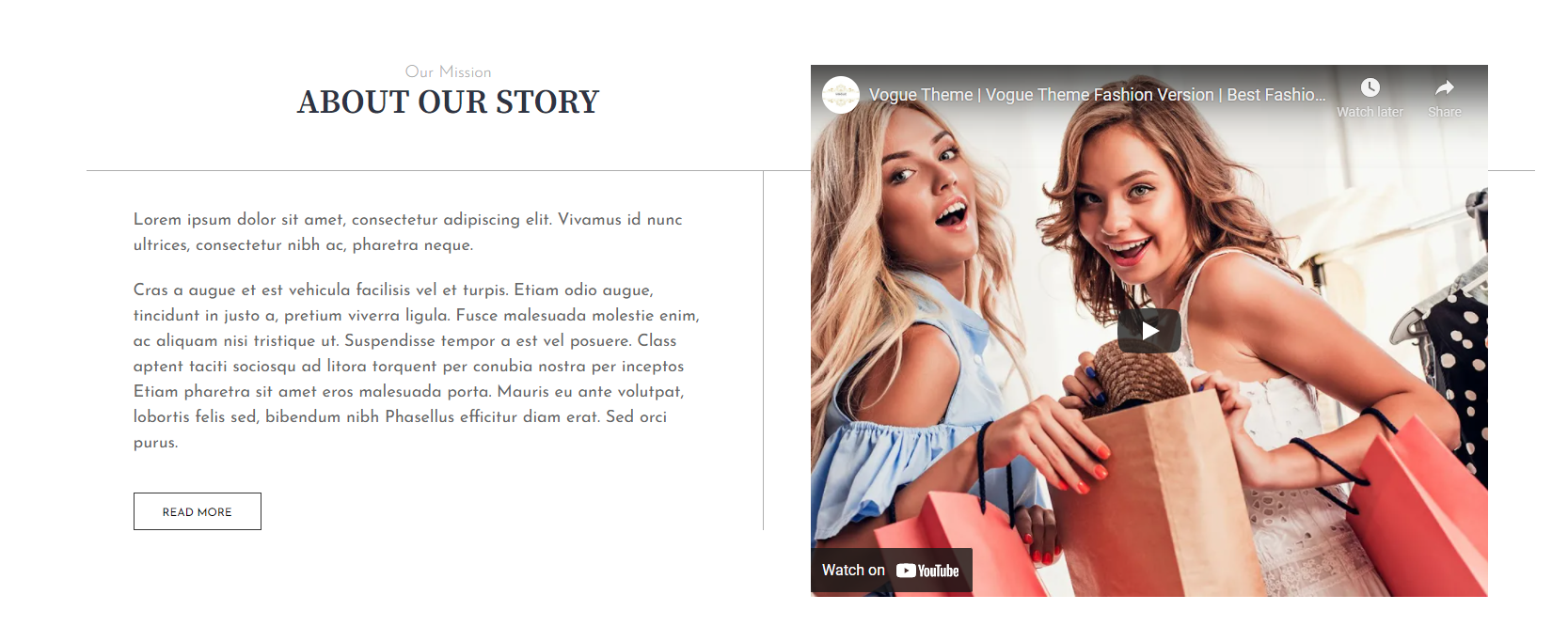
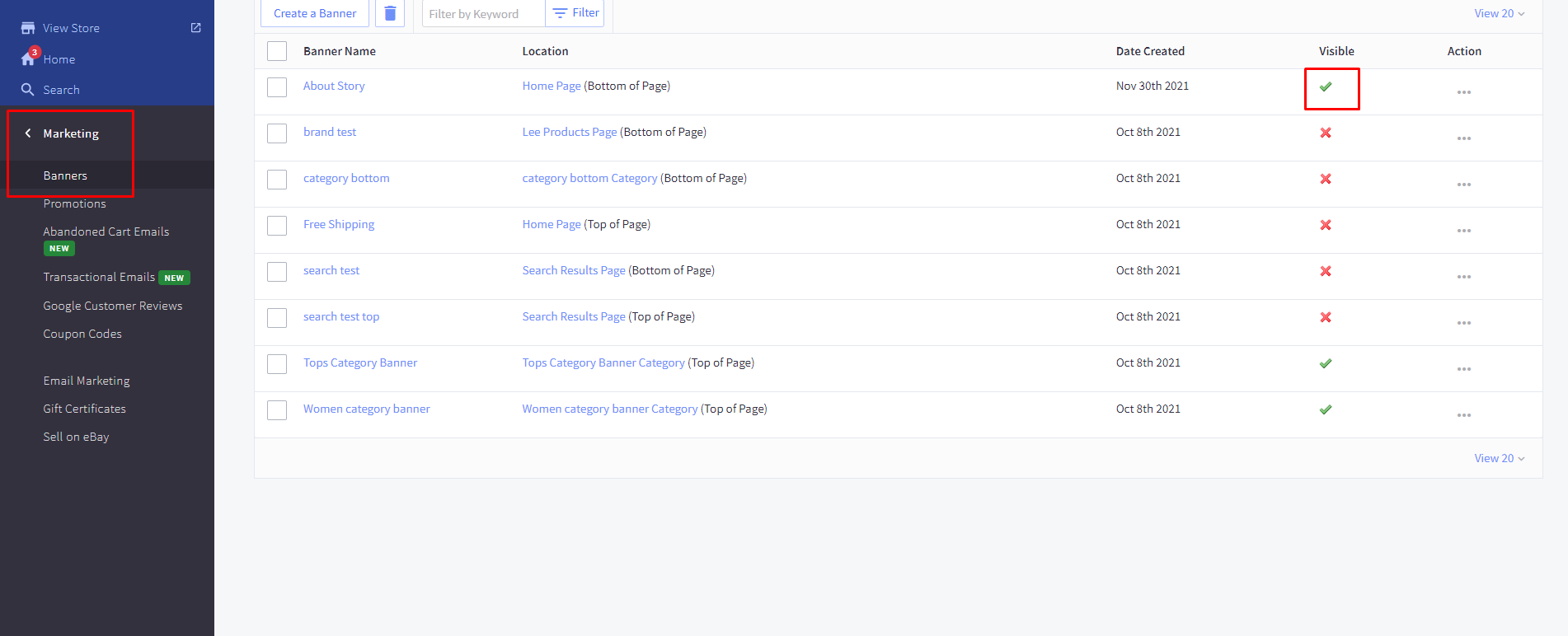
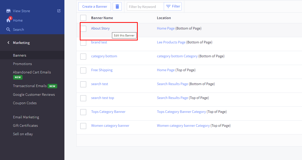
For About US Section, In your control panel, go to marketing > banners.
Enable / Disable About Our Story Section: In your control panel, go to marketing > banners. You can toggle the visibility of this section by clicking the icon under “Visible” Column.
Edit About Our Story Section:
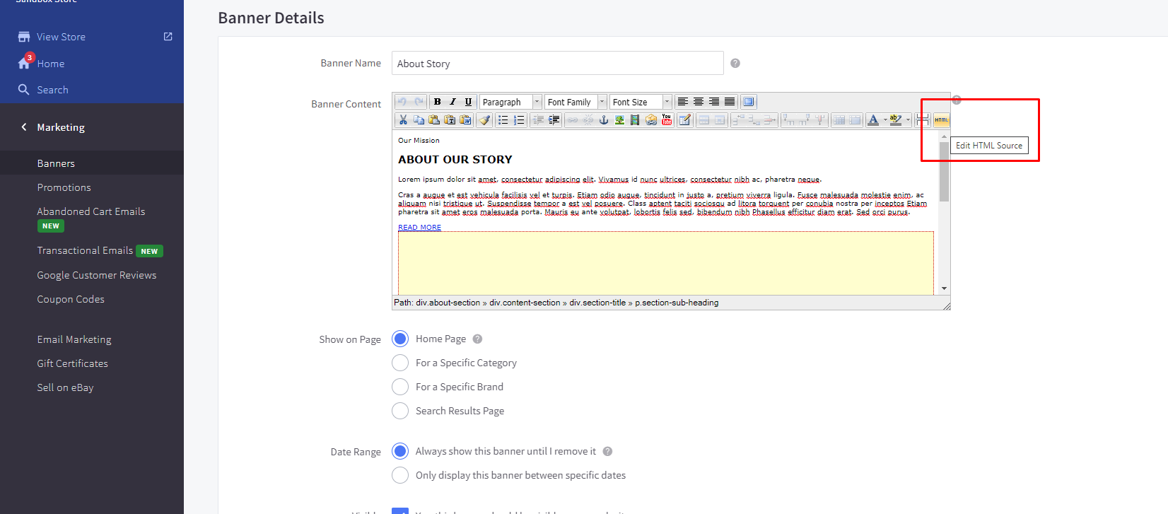
- To Edit About Section, click on the About story banner name.
- Banner details will appear like this :
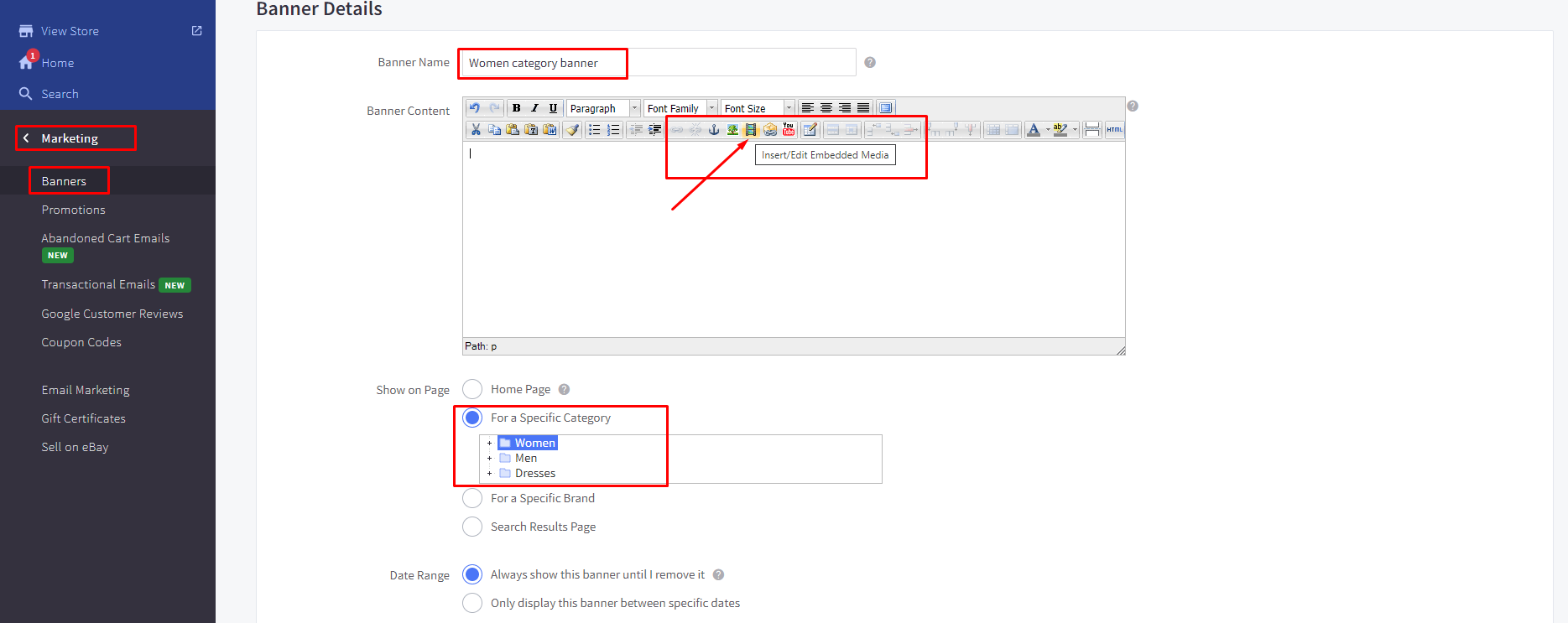
- Then click on “Html” button on the header of the banner content window :
- “HTML Source Editor” popup will open.
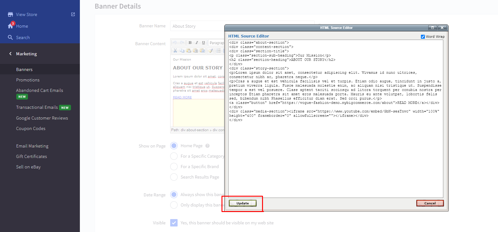
- Then you can edit Section Heading & Sub-heading, Description, Read more button text & redirection link. Also you can edit your video link or image.
Note: Don’t remove or edit html tags or class, it will change the design view of the section.
Furniture Variant :
- In furniture, About section is added from the page builder.
- Drag & drop HTML widget below most popular product section on the highlighted area
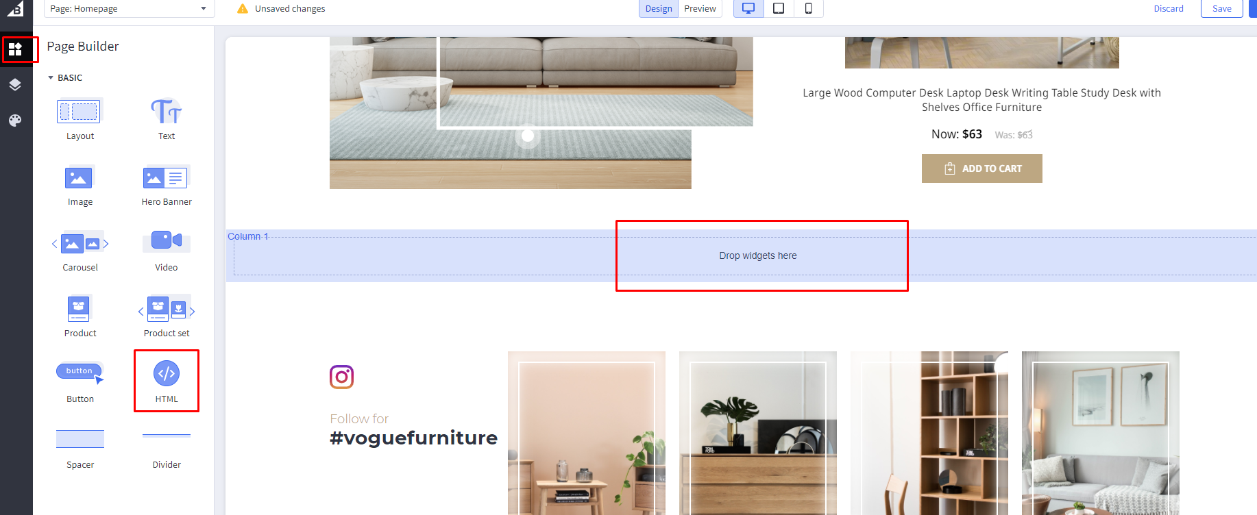
- Replace the HTML code with this and click save HTML button :
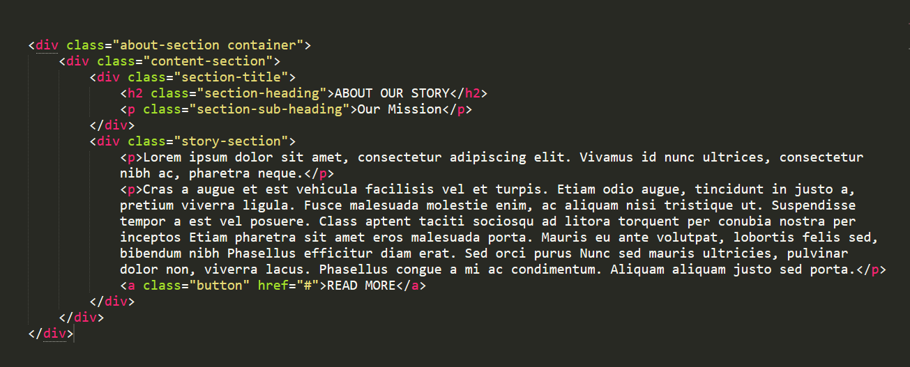
- Don't change any HTML tags or remove any class. You can edit Section Heading & Sub-heading, Description, Read more button text & redirection link.
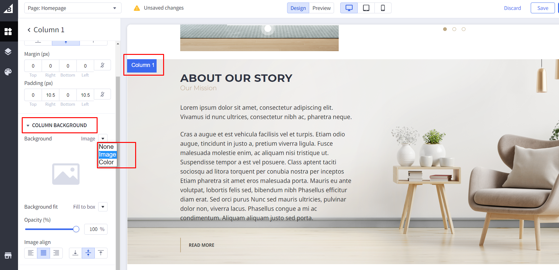
- Go to section layout and change Layout name to “about-section”.
- To add background image, select column layer and go to column background, select “image” from dropdown and upload image.
Instagram Section
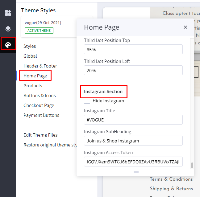
This section shows instagram posts you have uploaded in your instagram business account.
Hide instagram : toggles the visibility of this section
You can add/remove/replace Instagram title and sub-heading
Instagram Token : add generated token in this field
Steps to generate instagram tokenNote: This token will get expired after 30 days so it has to be re-created. Steps to re-generate instagram token
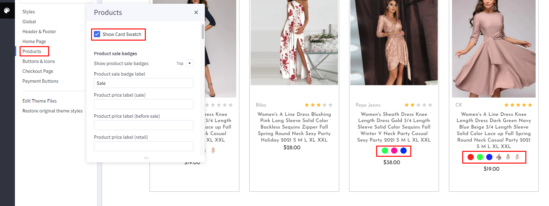
Products Card
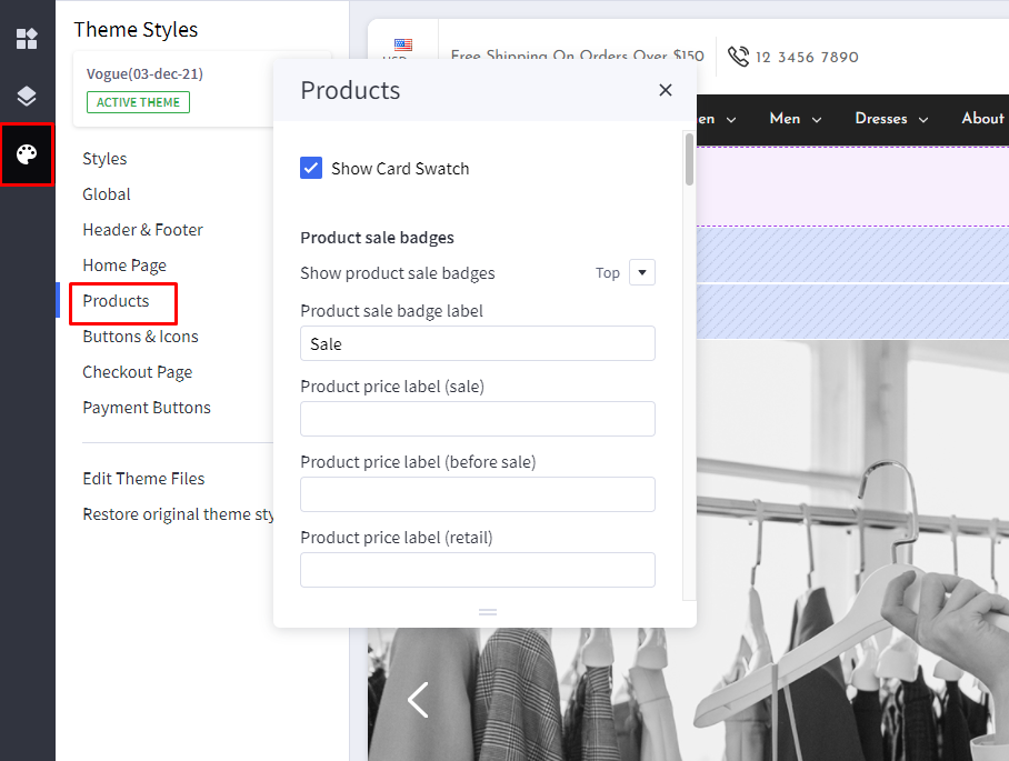
Show Card Swatch: toggle visibility of the Card Swatches
Category page
- Category image added from the admin side will not appear on the main category page.
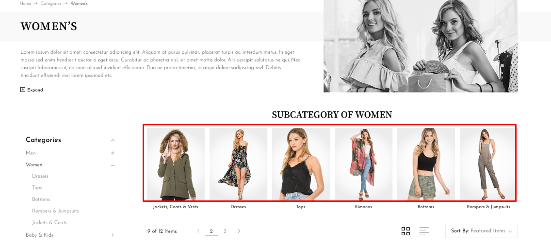
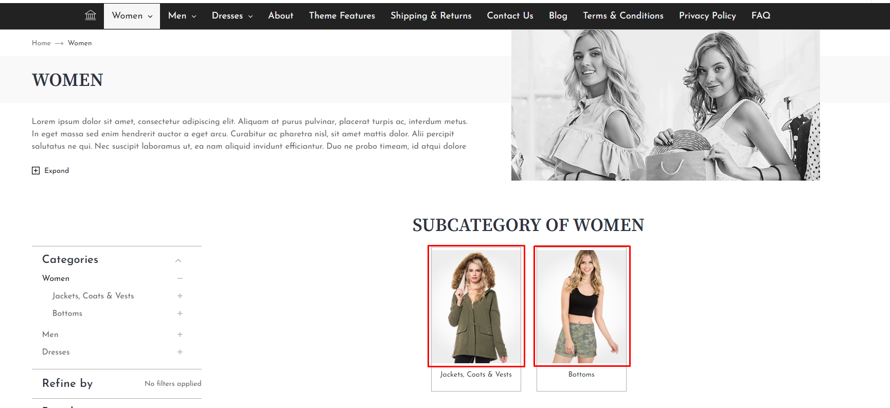
- All the subcategories will be visible on it parent category page with its category image like this :
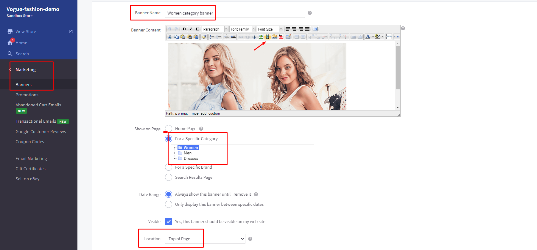
- Right side banner on category page will come from marketing banner :
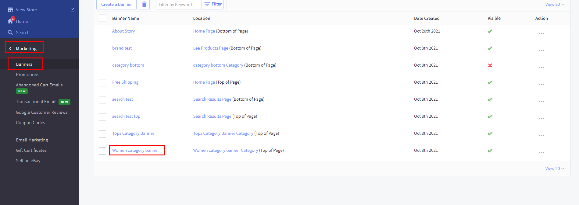
- You have to create a banner, add an image and assign it to a particular category in which you want to show the image :
Product Page
Display settings
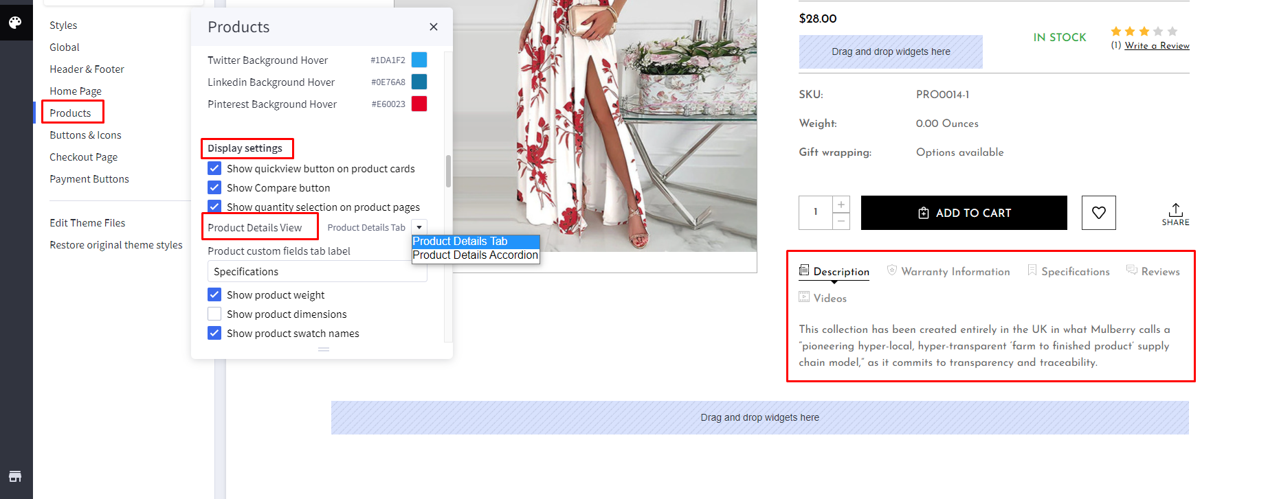
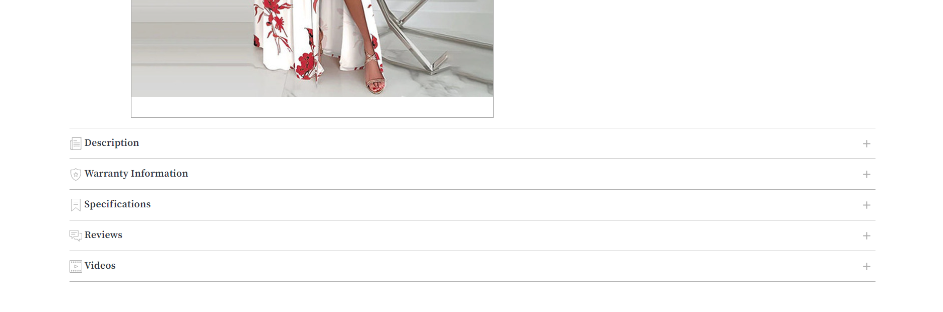
Product Details View: Select the Product Details View display mode. If you want to display a tab or accordion. You can select the settings from here.
- Product Details Tab view:
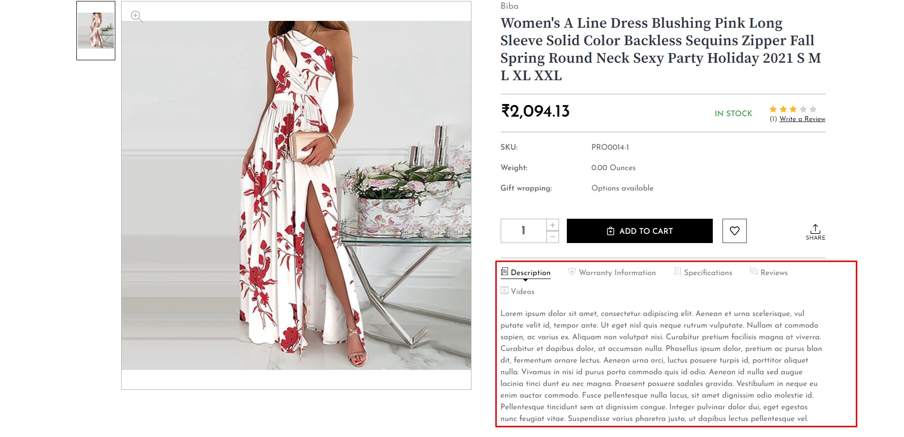
- Product Details Accordion Tab view
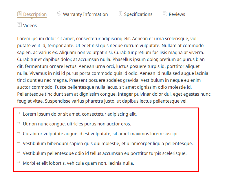
All Custom field details added from product admin will be displayed under the “Specification” tab. To add arrow style before the list items in description content list, add class=”arrow” in the HTML ul tag.
Social Sharing Icons:
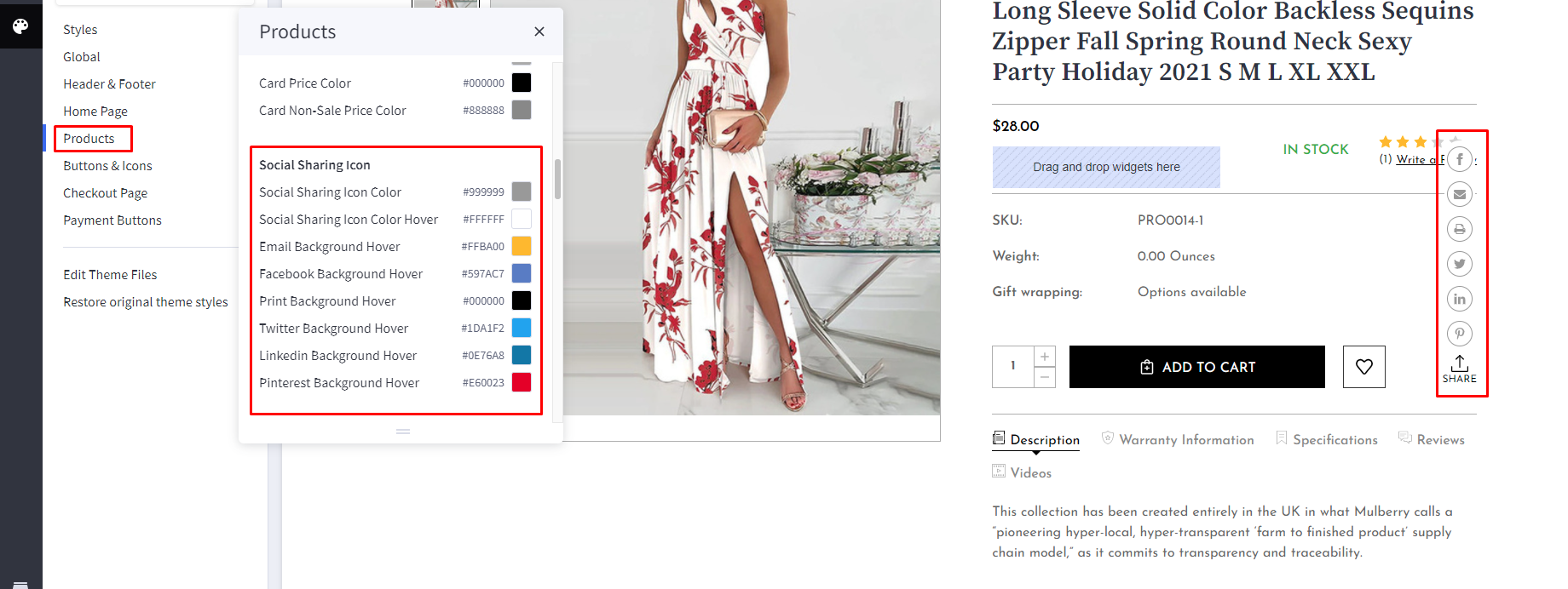
Social icons colors can be change from here.
Note:
- All other settings and features are the same as cornerstone theme.
- All images are added in Storefront > Image Manager, that's why it will show broken elements when you first upload the theme in your store.Steps to add image in Image Manager is mentioned above in USP section.
Image Dimension
Vogue Fashion Variant :
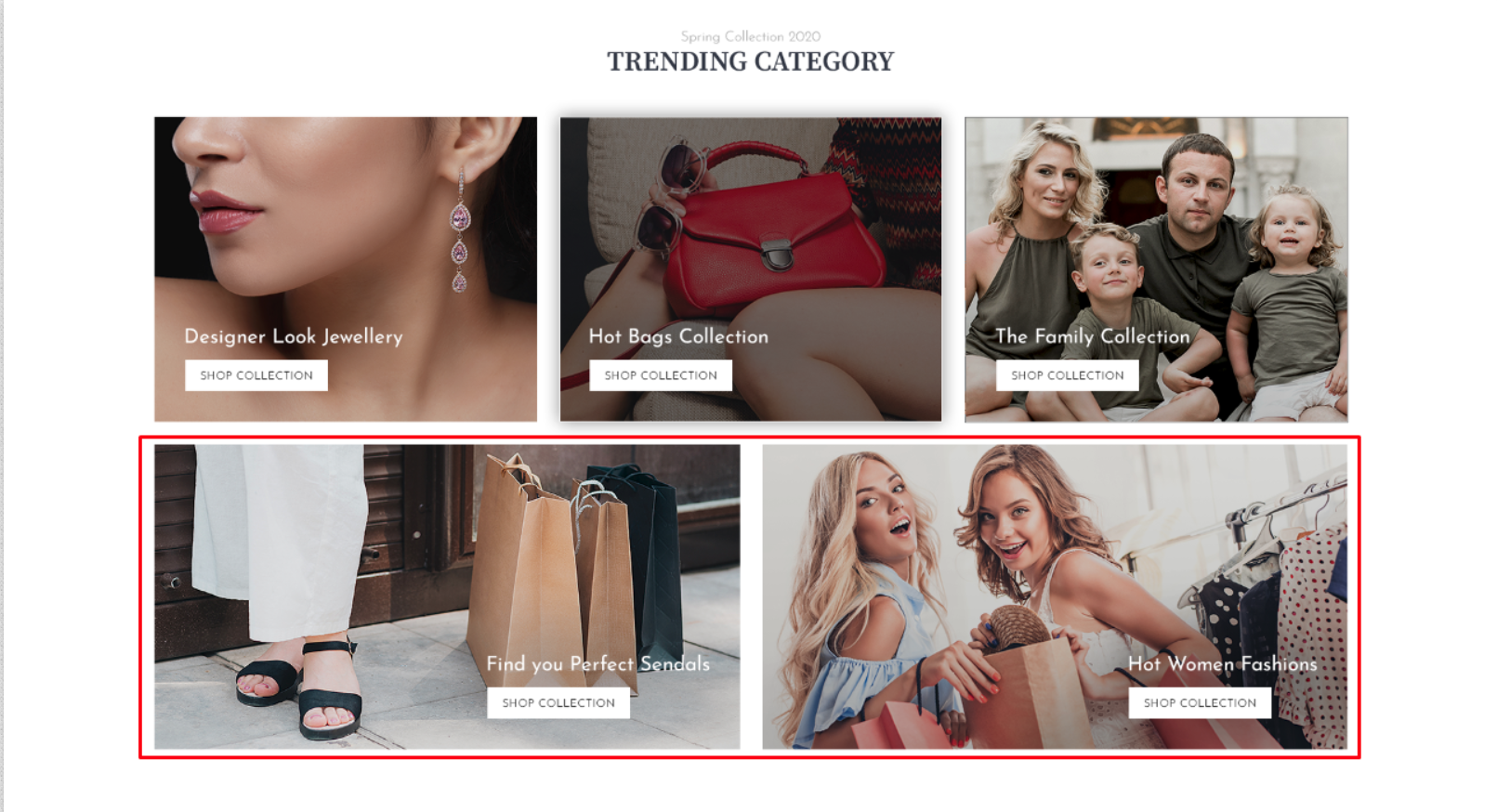
- Trending Category -
- Top 3 images : 494x394px
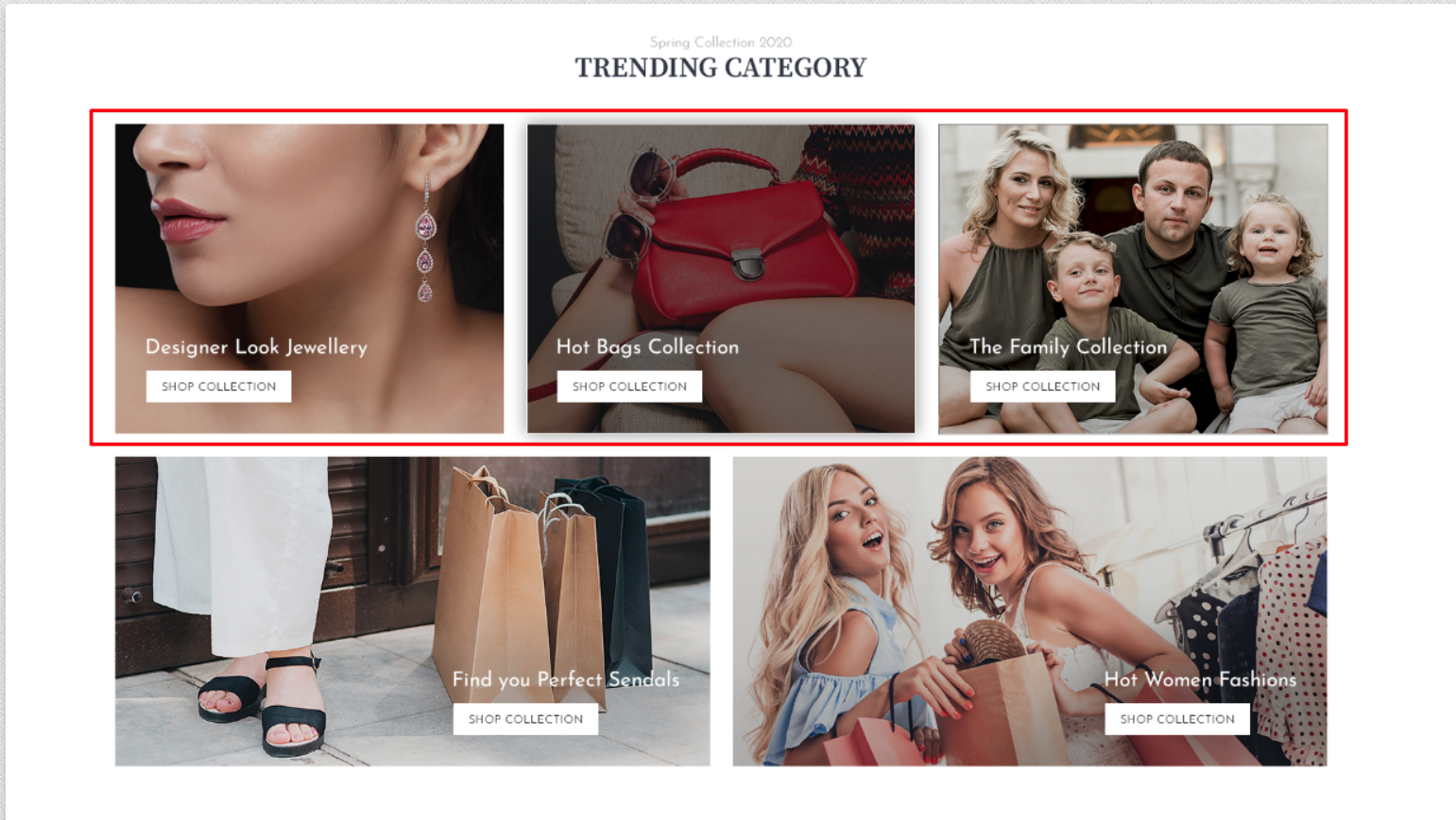
- Bottom 2 images : 756x394px
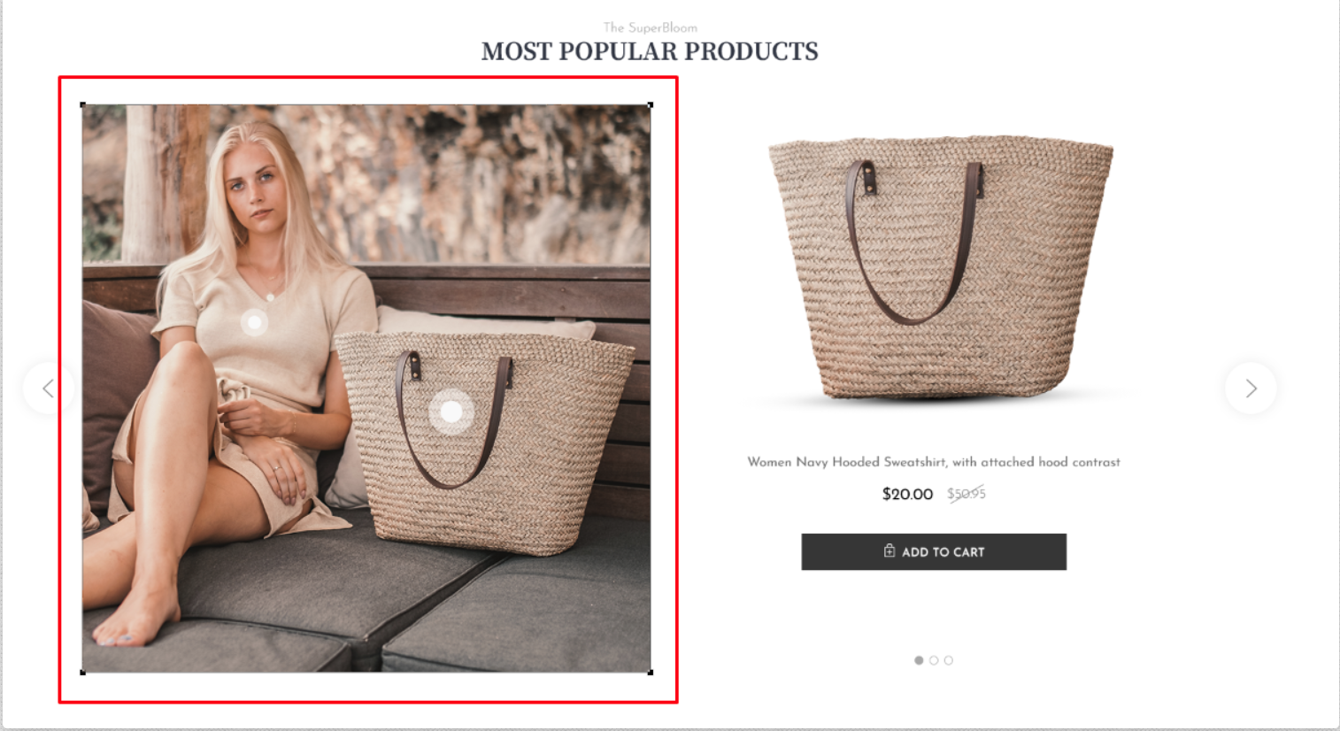
- Most Popular Products -
- Main image: 770x770px
Vogue Jewellery Variant :
- Trending Category -
- Left & Right images : 464x857px
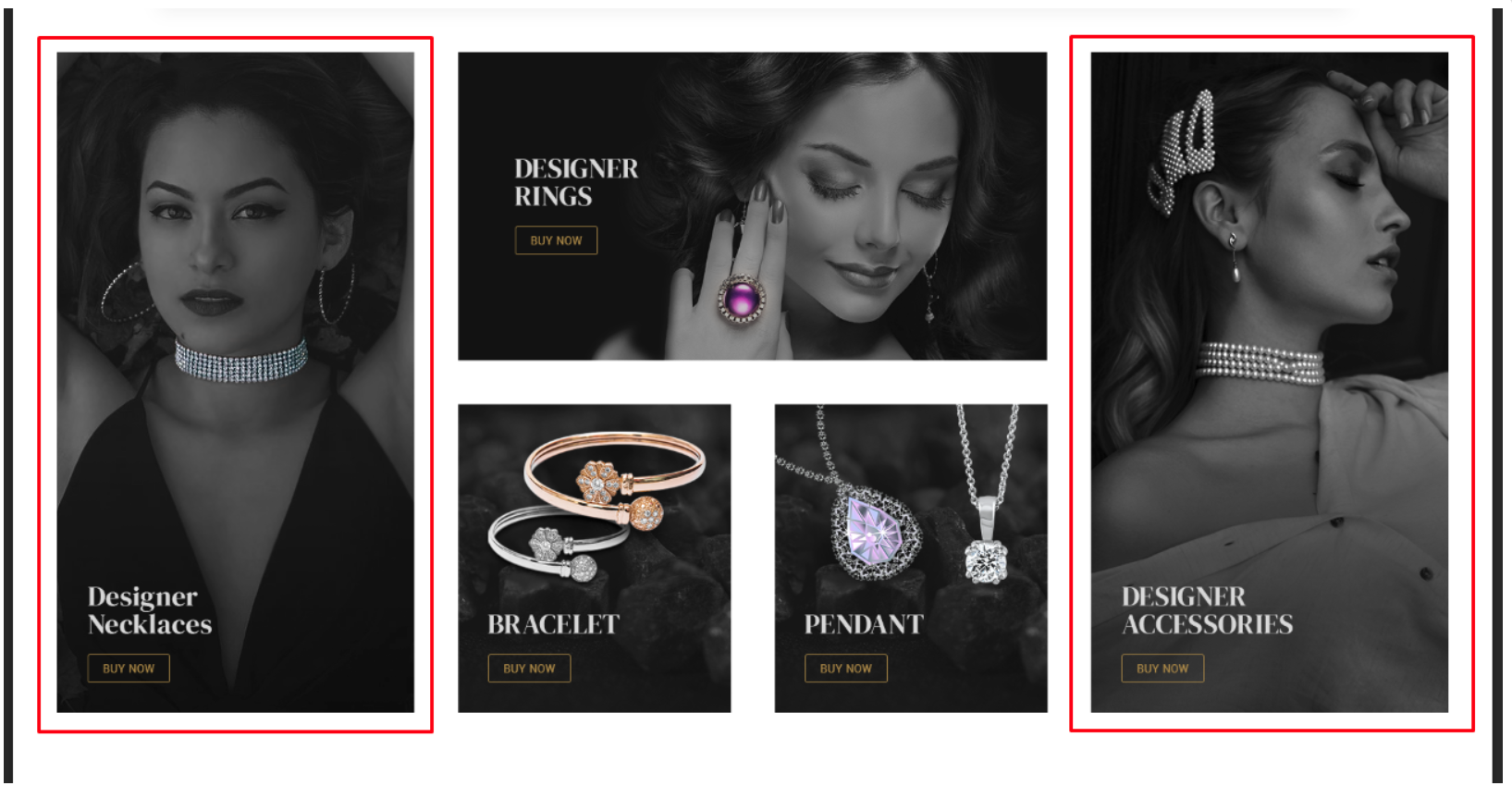
- Center top image: 764x400px
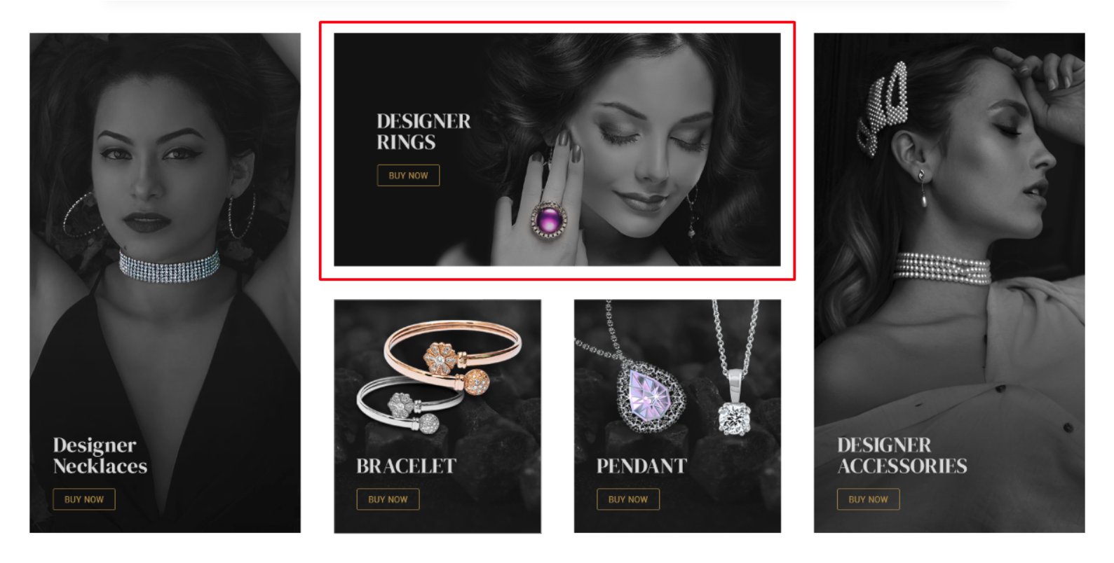
- Center Bottom 2 images : 354x400px

- Most Popular Products -
- Main image : 1107x770px

Vogue Furniture Variant :
- Trending Category -
- Left & Right images : 430x438px
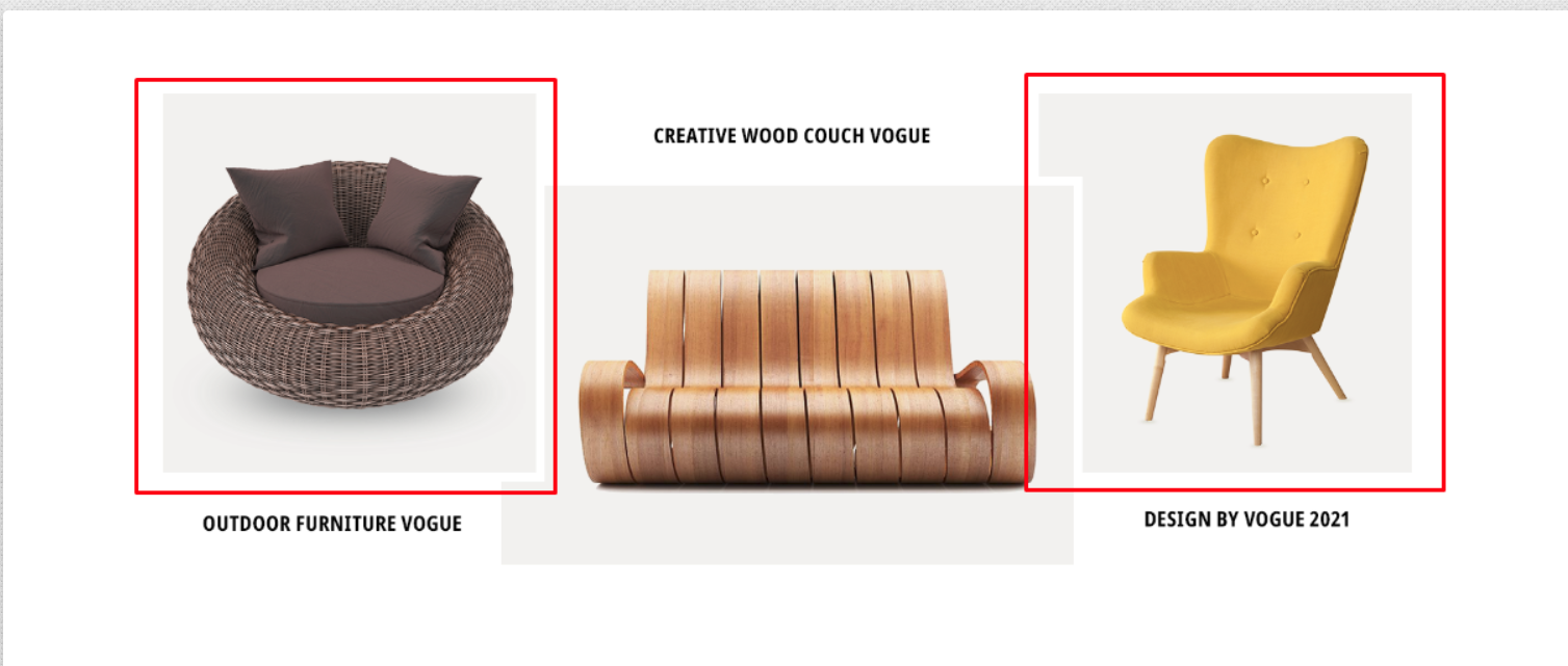
- Middle image : 660x438px

- Most Popular Products -
- Main image : 720x670px

SubCategory Image dimension : 179x228px